QUZERA
Rebuilding a brand that is destined to reign

The Challenge
QUZERA, a brand that provides digital marketing solutions to small and medium-sized businesses around the world wanted us to redesign their logo. The idea was to design a logo that holds the valuable qualities of being Futuristic, Global, and Friendly to make QUZERA be known for its ability to provide Intelligent Digital Marketing Solutions.
The Solution
Our work commenced with circling back to the fundamentals of who they are and what they represent, and gradually closing the gap on each element of their brand as we proceeded.
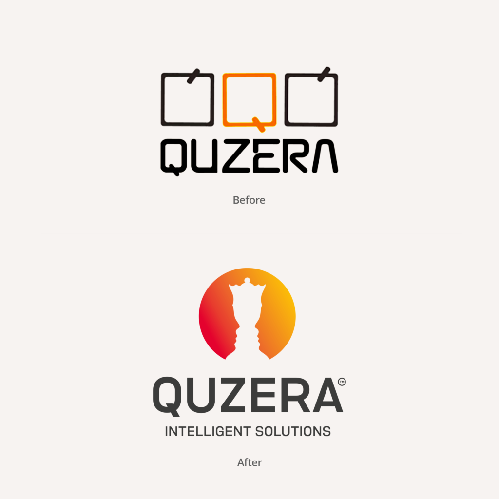
To begin with, the old logo had three Qs in the shape of a clock with the hand pointing at different times to represent they offer round-the-clock outsourcing to their clients. Though this is in fact what they did, didn’t seem to suffice their credentials today.
Today, the brand has grown in many ways from offering dedicated round-the-clock services to offering intelligent, out-of-the-box digital marketing solutions using innovative strategies. In the land of bland, blue-tinted enterprise identities, we saw QUZERA as a powerful, multicolored, magical unicorn.
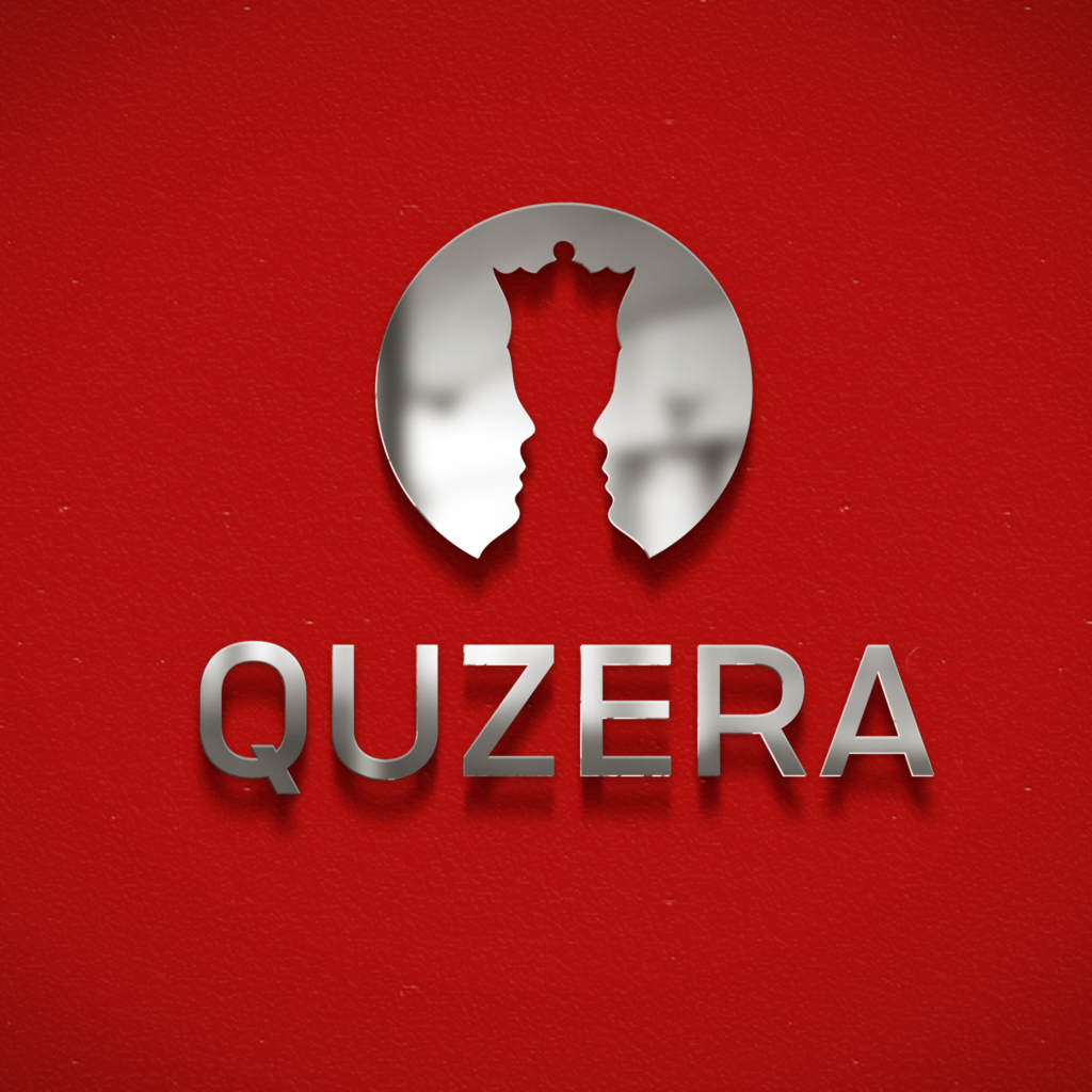
In the effort of projecting a flamboyant image that reflected the smart, friendly nature of QUZERA, we were inspired to adopt the concept of the game Chess. The fundamental element of the design is Rubin’s Vase/Rubin’s Face – a famous set of ambiguous two-dimensional forms.
The visual of The Queen was designed as the Vase. The Faces on either side represents QUZERA’S Clients and their Customers. The sole purpose of this design is to clearly indicate that QUZERA is the brand that connects Clients to their Customers.


