Dynamo
Identity design for an enterprise software & services provider

The Challenge
Dynamo specializes in SAP implementation, support services and customizations for companies of different sizes. They wanted their new brand identity to modernize the appearance of their current profile in order to stay in line with the uniqueness of their target audience. They wanted their logo to personify their strengths as a superior, sophisticated, professional, and tech-savvy brand.
The Solution
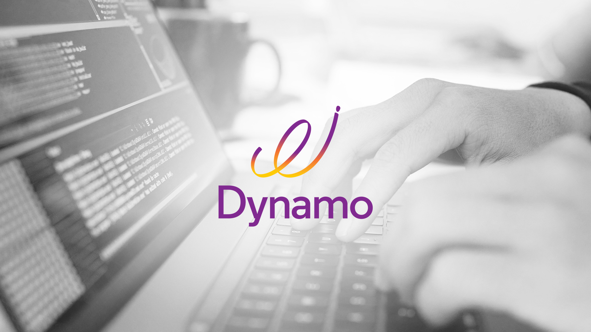
The idea for the logo sprouted with the ‘Spiral’ – a symbol of holistic and consistent growth. We combined the idea of a consistent Spiral that denotes growth and the letter ‘d’ that stands for DYNAMO. For the design, we used the 3-dimensional view of the spiral adapted to suit the appearance of the letter ‘d’. The colour purple was chosen to reflect the feeling of sophistication and superiority and the slight gradient with the orange and yellow tones made the logo more playful and modern.

