RedLeaf
Revitalising Brand RedLeaf
The Challenge
REDLEAF is an organization that provides IT solutions to businesses. Solutions provided by REDLEAF are targeted at reducing the carbon footprint of companies and making them eco-enterprises. REDLEAF wanted to revamp its existing identity in order to portray them as a global enterprise. They also wanted their identity to depict their love for nature.
The Solution
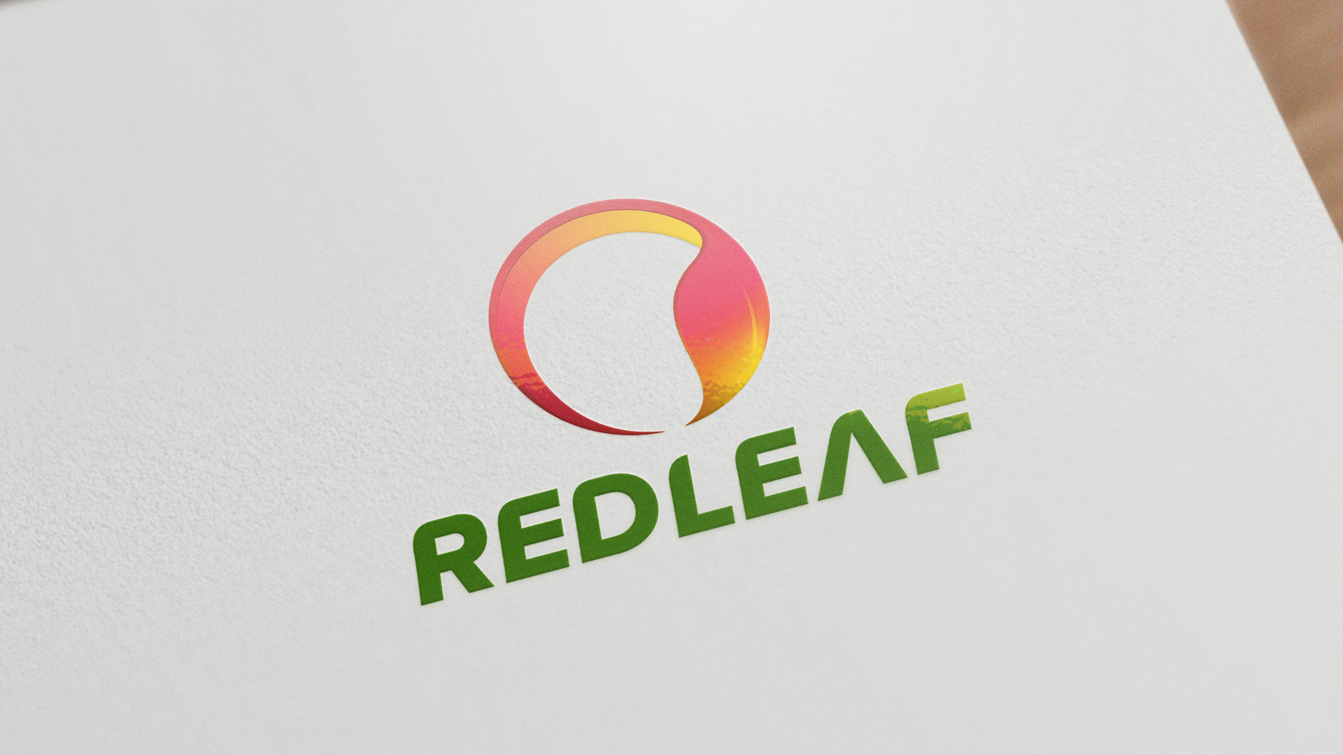
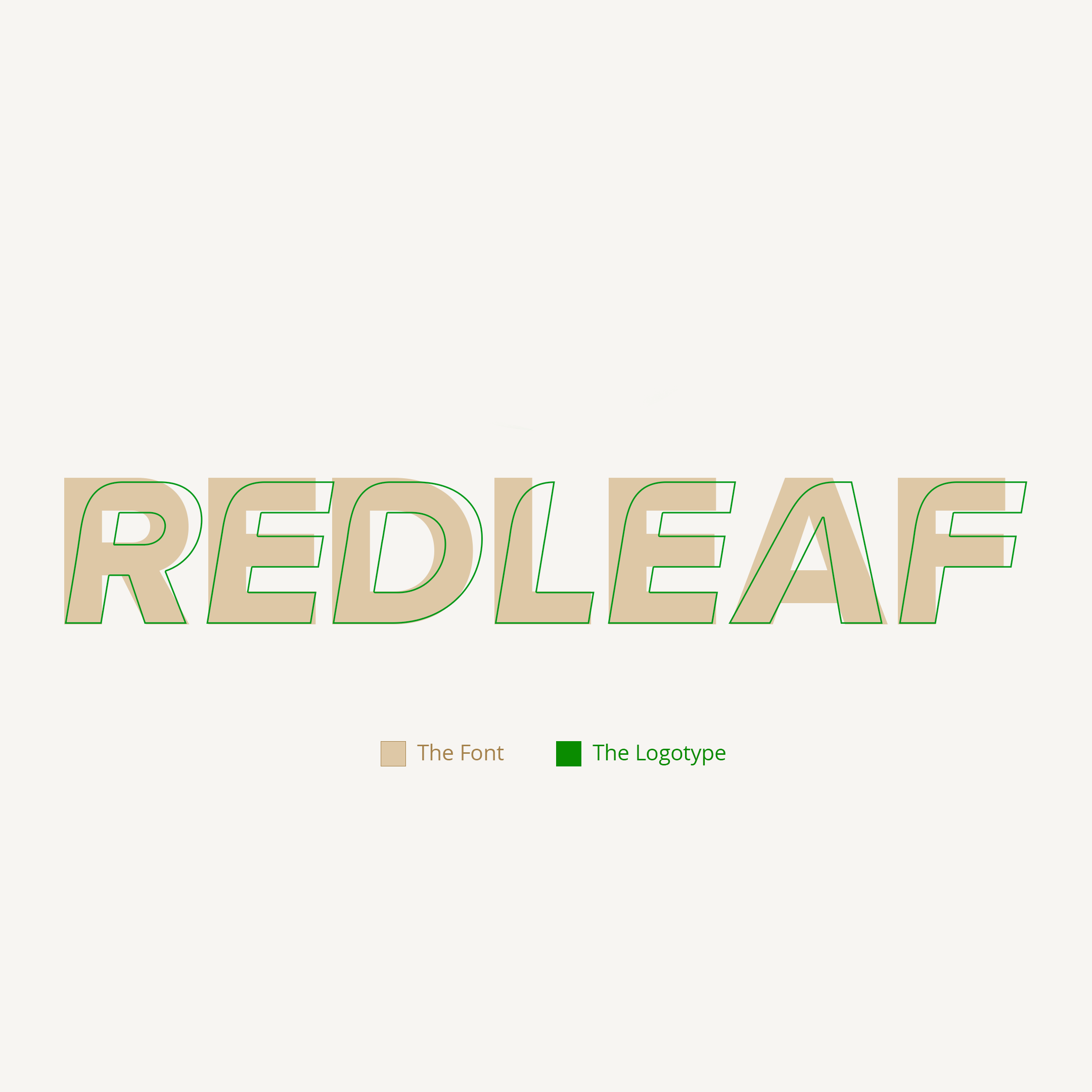
To develop the mnemonic, we combined the visual representation of the globe and the fall leaf. We chose the fall leaf because the brand is named after it. For the logotype, we created a unique typeface that was futuristic and it blended well with the mnemonic. In terms of color, this is the first time that we have used so many colors in an identity. For the purpose of flexibility, we have created a mesh-based color version as well as a solid full-color identity.

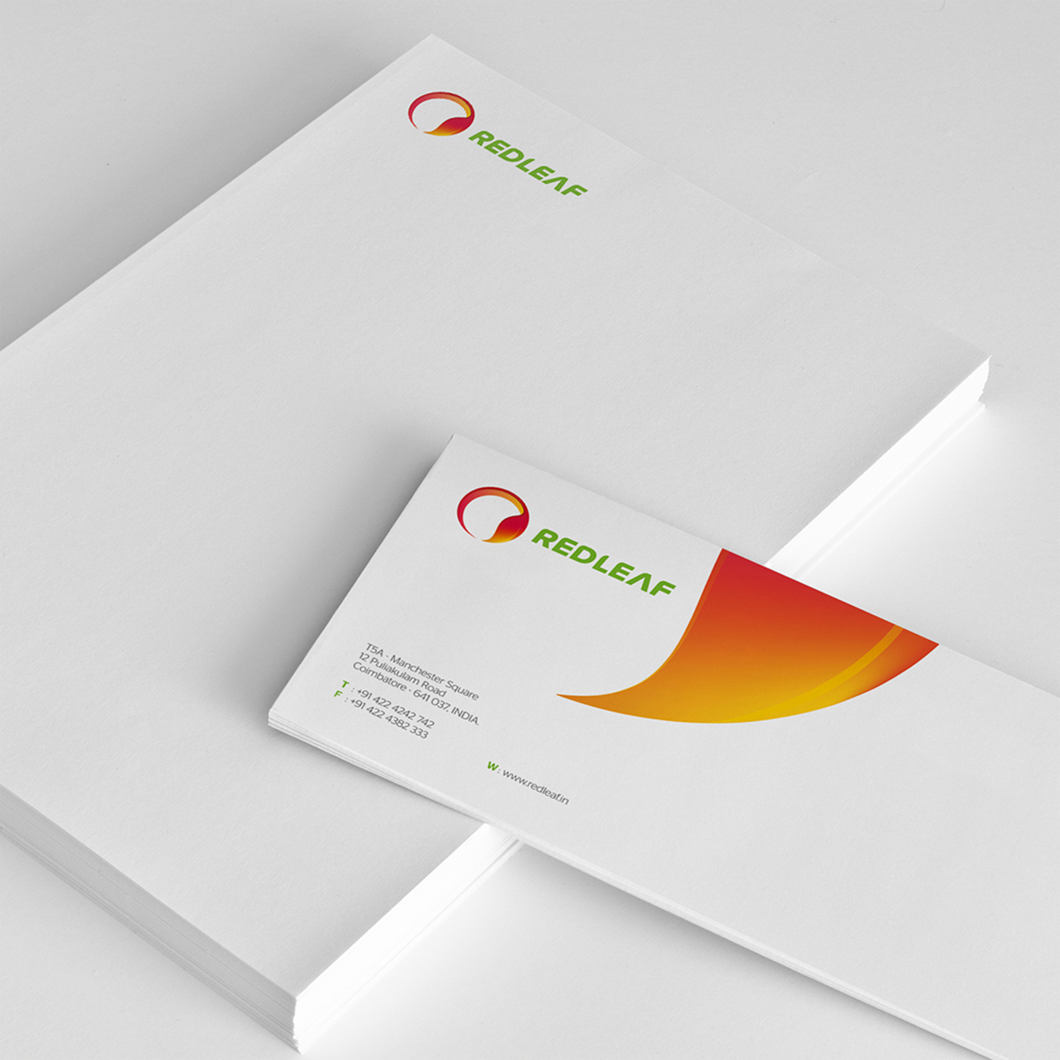
The fall leaf was depicted in the logo because the brand was named after it.
