Amirthaa Dairy
Crafting the communication for Amirthaa to improve their retail efforts
The Challenge
For more than 3 decades, Amirthaa had built a small but dedicated following. Naturally richer, creamier, and above all fresher than ordinary moo juice, With a variety of value-added goodies like butter, ghee, paneer, buttermilk, lassi, khova, curd, and dairy whitener Amirthaa was making a mark in the regional dairy food scene.
They were a growing enterprise when we met them. They were ready to be spearheaded for a new wave of evolution across the panorama of branding, offering maximum value and satisfaction to consumers.
The Solution
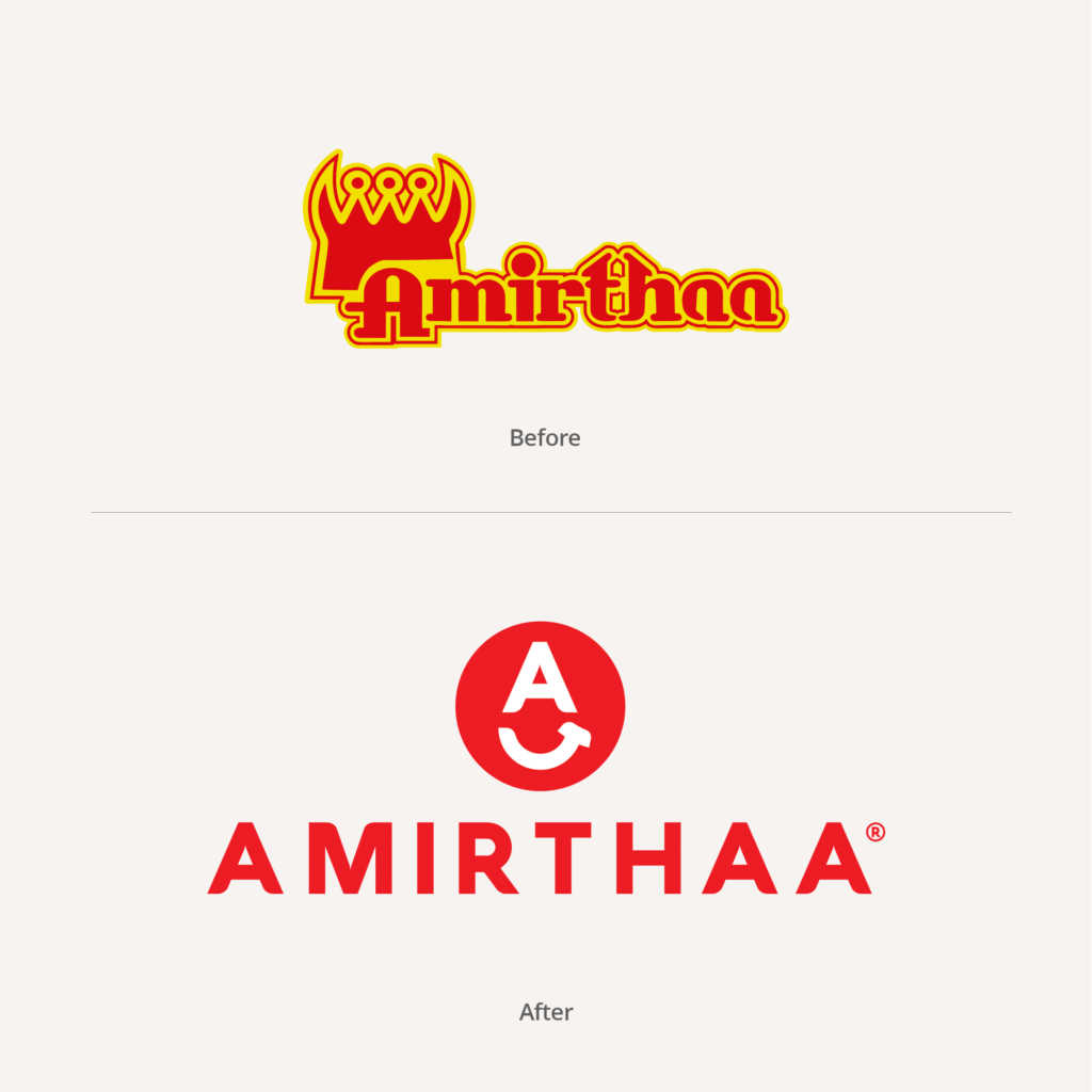
The inspiration for the branding was the phrase “Lip-Smacking Taste”, especially with the depiction of tasty dairy products. The image of people smacking their lips as they enjoy tasty food is unmistakably heavenly.
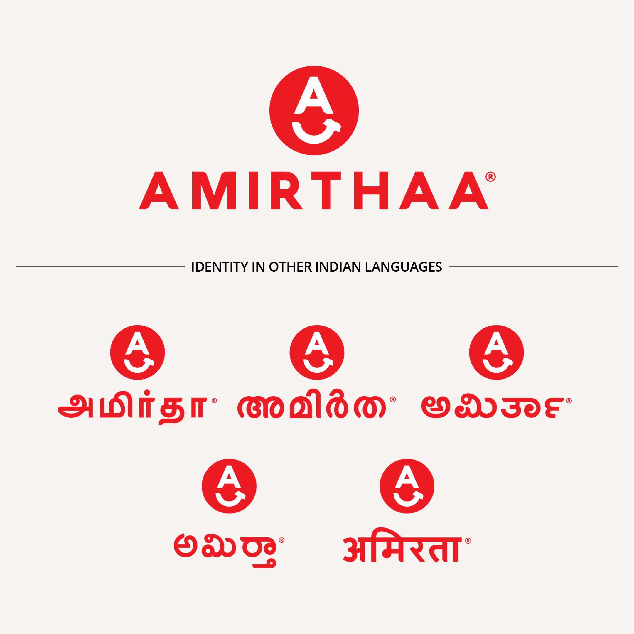
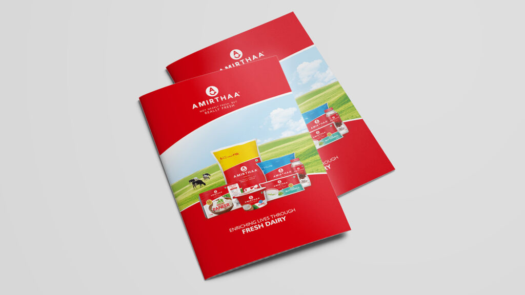
The modern typeface and the universally recognised representation of a smile gave the logo an air of charm and sophistication. To cut a long story short, we presented Amirthaa for what they are best known for – their commitment towards delivering the freshest milk, absolutely untouched by hands, plus a distinctive policy of retrieving the unsold milk within two days from the sales outlets. We nailed on this image with the statement “Not Nearly Fresh, But Really Fresh”.
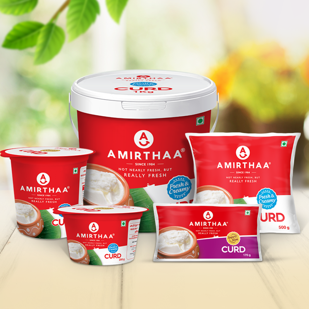
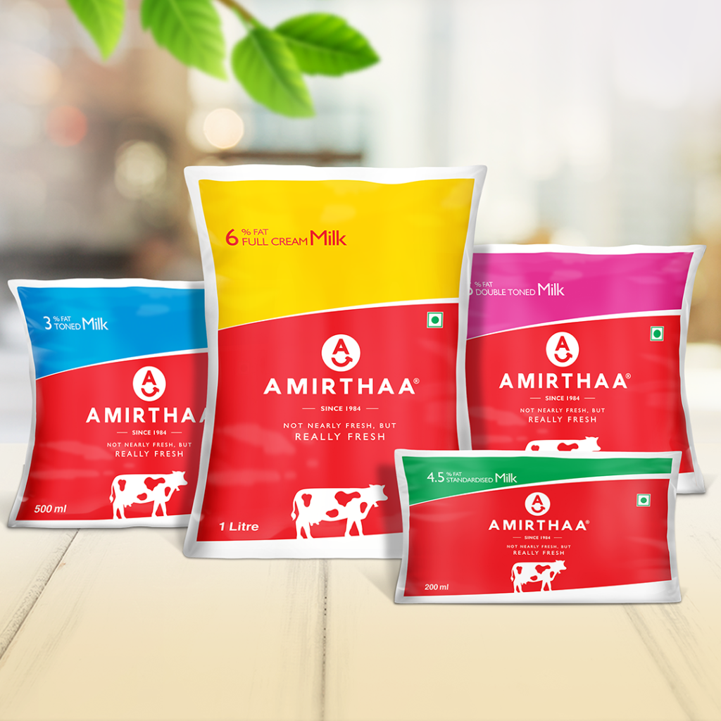
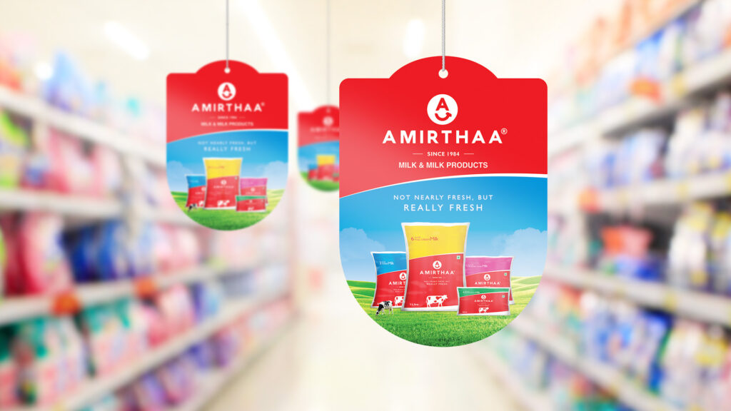
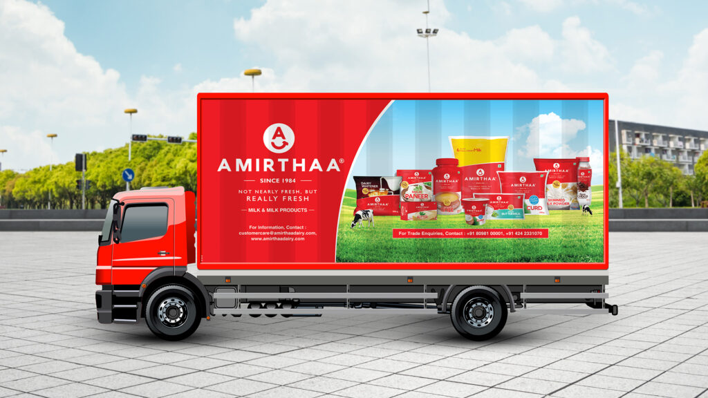
We saw Amirthaa as an energetic, passionate, and strong brand. Realising the best way to communicate these qualities was to use the colour Red; we made a bold attempt, unlike any other brand. We insisted on using red as the standard colour across all sorts of packaging. We were sure that red will make Amirthaa stand out from other brands perching on the shelf. We made use of other pleasant colours like yellow, blue, green, and pink to compliment the red.

