Viswa & Devji, a retail diamond jewellery brand, is a professionally managed diamond cutting and jewellery manufacturing enterprise with a strong exposure to international markets. With more than five decades of experience, it has a thorough understanding of the intricacies involved in crafting fine jewellery. They wanted us to assess Viswa and Devji’s existing logo design and make recommendations to improve its visibility and impact.
Discovering the Brand
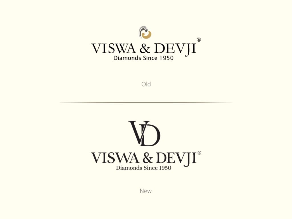
We spent time dissecting context and history to properly comprehend Viswa and Devji – their beliefs, company, and brand traits. Prior to analysing the logo’s effect, we dug deep to see if the logo accurately represented the brand’s characteristics. Viswa and Devji brands employed an emblem that resembled a heart but was unfamiliar to their clients.
We inquired about critical matters:
Is the emblem significant enough to spark people’s interest in the brand?
Is the icon a critical component of the brand’s value proposition?
The previous logotype was created using a serif typeface with thick and thin strokes. Our first investigation found that it was a well-established style that was adopted by most luxury brands. Also, the company’s tagline ‘Diamonds Since 1950’ lent legitimacy to the brand. Additionally, Viswa and Devji were not benchmarking domestic brands, but to iconic foreign companies such as Harry Winston, Cartier, Tiffany & Co., and Gucci, which catered to an affluent and elite clientele. We were able to make inferences about the brand to develop a logo that would appeal to prospective and current clients.
Building the Logo
Our research yielded several observations. Brand Viswa and Devji employed a combination logo (icon + logotype) coupled with a baseline in all forms of communications. While examining world-famous luxury brands, we observed that the majority of firms preferred to employ the symbol and logotype independently. The majority of icons were either initials or designs based on initials. With the information gleaned from our investigation, we chose to develop a defined graphic and text style that would aid in creating a distinctive impression.
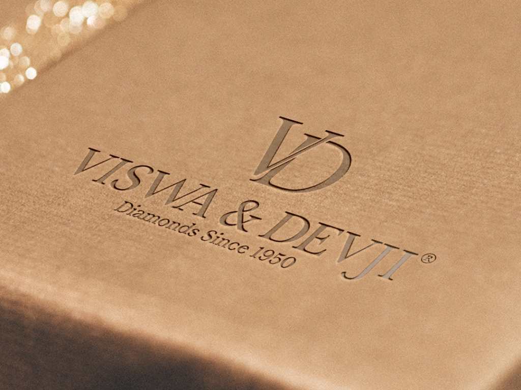
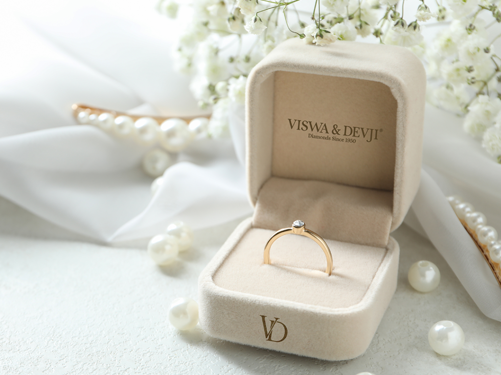
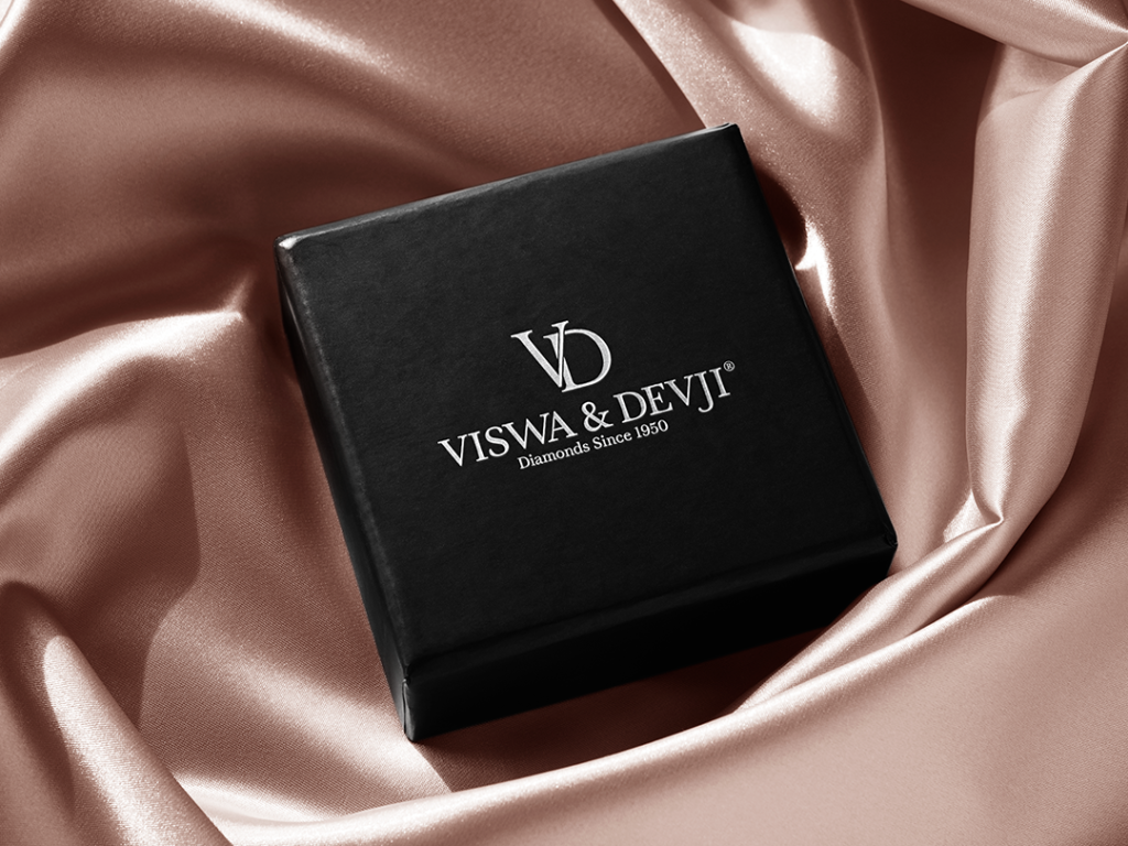
We created a new simple logo with an attractive typeface, thicker stems, and new initials that elevated the brand’s image in preparation for a new path.
Creating a new logo for Viswa and Devji was a novel and engaging experience for team HUT, as we followed benchmarks to produce a design that effectively communicated the brand’s image while also appealing to an elite audience.


