House of Prathishta
Bringing Botswana’s Essence to Life

The Challenge
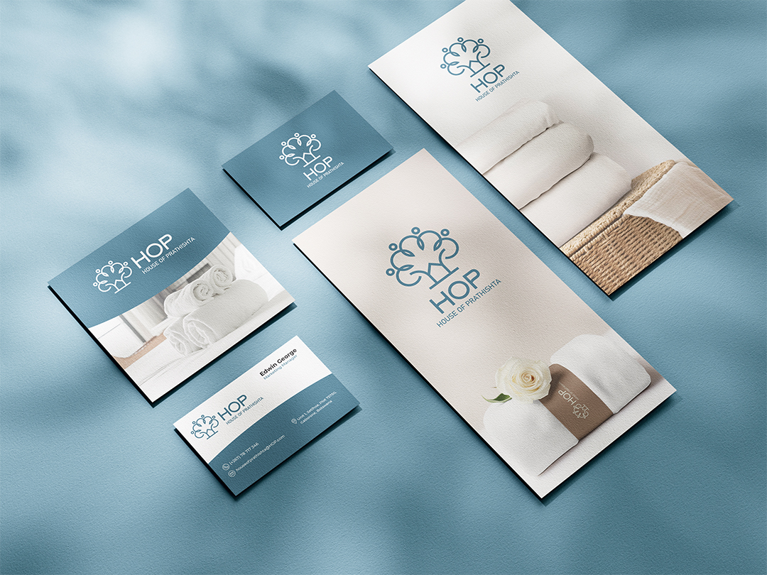
Our journey with House of Prathishta (HOP) began with a unique challenge. We needed to create a logo that would stand out in the luxury bed linen market while honouring Botswana’s rich heritage. Our research showed that most luxury textile brands use traditional serif fonts in their logos.
We set out to create something special – a logo that would work everywhere, from tiny labels to large store signs. It needed to look premium and welcoming at the same time. Most importantly, it had to capture Botswana’s natural beauty without losing its luxury appeal.
The Solution
After careful consideration, we developed a logo that tells multiple stories at once:
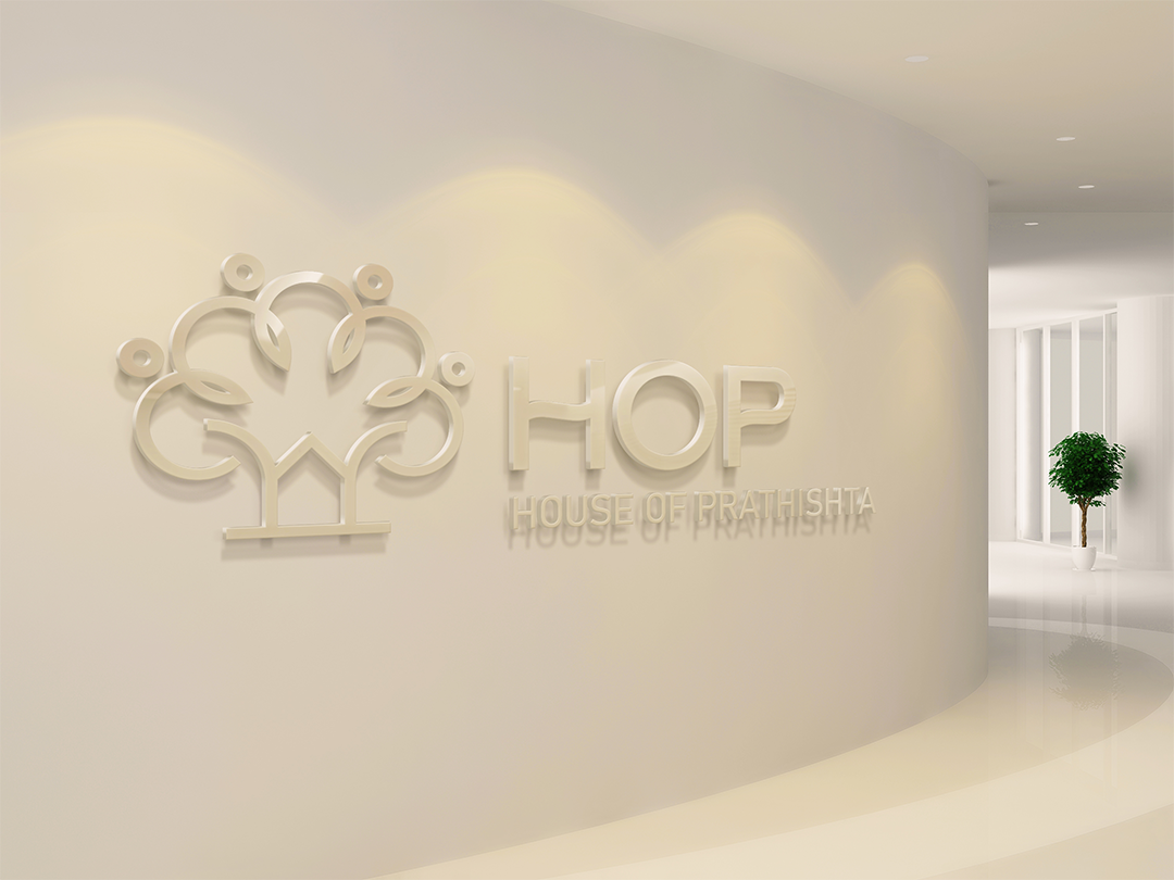
The House Element: We started with a simple house shape. It’s not just about the brand name – it represents the comfort and warmth that HOP’s products.
The Tree Design: Looking at Botswana’s stunning landscapes, we found inspiration in its trees. We created flowing, abstract branches that give the logo a natural, organic feel. This helps HOP stand out from the usual rigid luxury brand logos.
The Prathishta Touch: Within the tree design, we carefully wove in traditional Prathishta elements. It’s subtle but meaningful – a nod to heritage in a modern design.
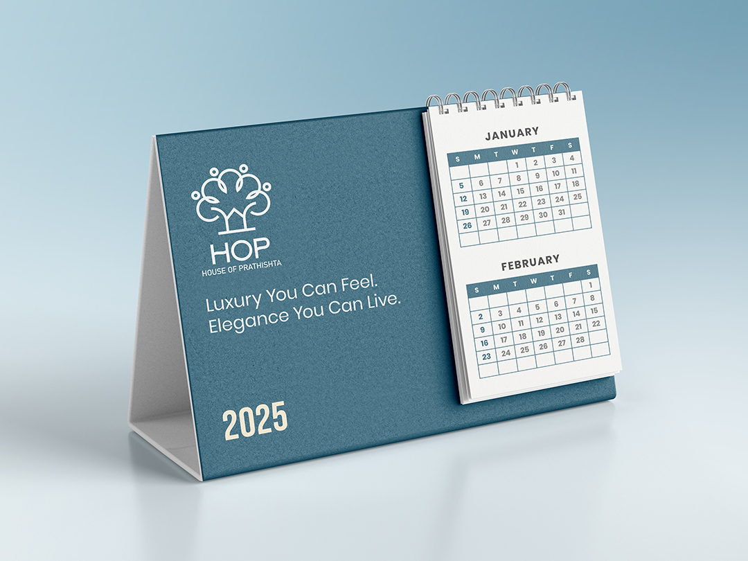
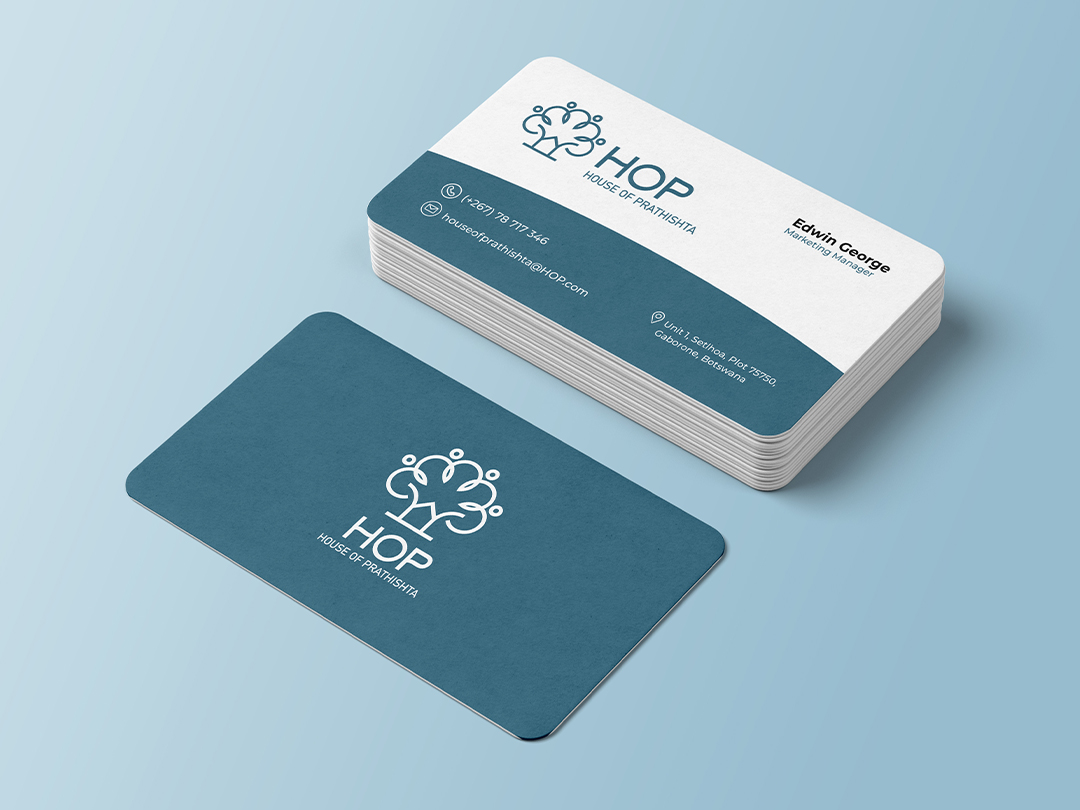
The Name: We kept the text clean and simple: “HOP House of Prathishta.” It’s easy to read while still feeling premium.


The final logo brings everything together beautifully. It’s modern yet timeless, luxury yet welcoming.