Technocart
Transforming Brand Technocart

The Challenge
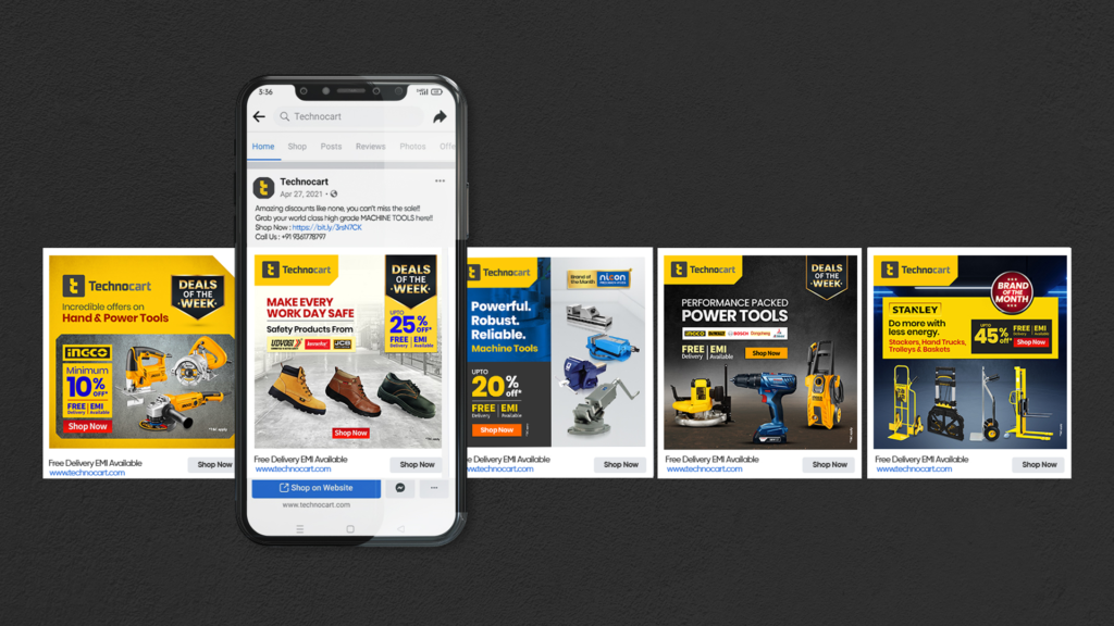
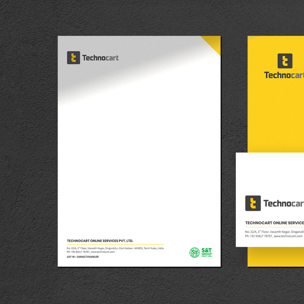
Technocart is an Indian e-commerce platform, selling industrial supplies for major industry verticals including, manufacturing and fabrication, logistics and warehousing, infrastructure and construction, agriculture, and gardening. We were approached to redesign the brand and its communication assets as the identity had become outdated and the brand was looking to explore new products, markets and avenues for promotion.
The Solution
We looked closely at Technocart’s existing logo. The brand name ‘Technocart’ was written out as a long word consisting of several short and tall letters. The logo contained 4 colors and the icon with tools in a shopping cart was limiting the scope of the brand.
Our preliminary decision was to minimize the number of elements on the logo to make it appear clear on all communications and to remove the tagline ‘One stop shop for all industrial products’ as it tended to become illegible on smaller areas.
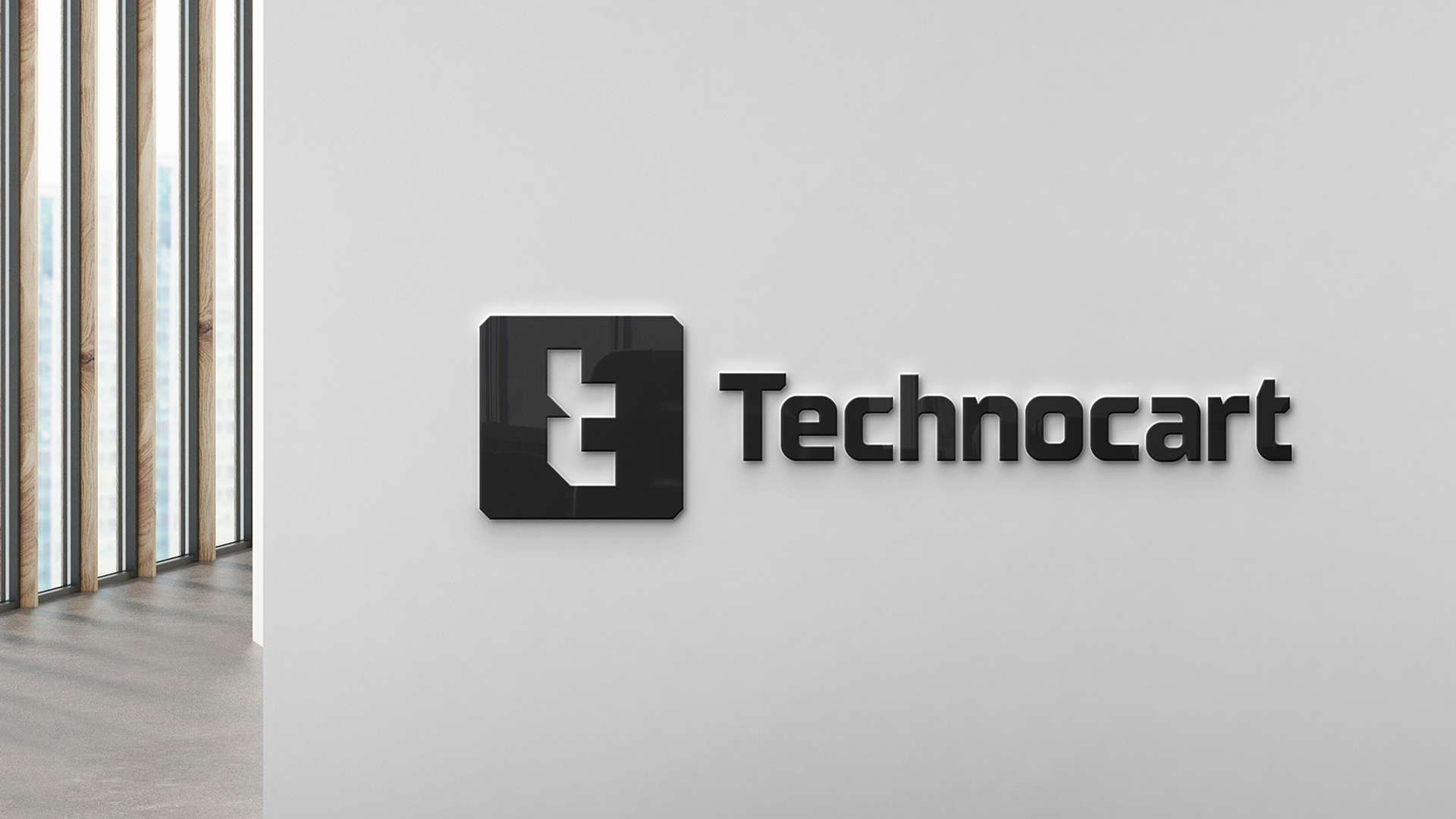
We designed an identity to make the brand easily identifiable on all platforms. The Letters ‘T’ (primary visual) and ‘C’ (secondary visual) of Technocart were designed in several styles to suit the platform and the nature of the business.
The Icon with the letter T+C was created with an equal width solid block in black to depict power and strength to indicate the nature of the industries catered to by brand Technocart.


For a logo to be advantageous for the brand, the logo had to be different from other logos in the category, relevant to the brand and the industry and relatable to the target segment.

