Brand name and identity for a cloud-based SCADA platform

The Challenge
As a new entrant in a highly technical and competitive market, a Tamil Nadu based cloud-based company needed a name and visual identity that clearly communicated its business while standing out from established competitors. The brand needed to express ideas of connectivity, synchronization, intelligence and automation without relying on generic symbols such as the brain. There were additional constraints to ensure trademark safety and the requirement to incorporate blue as the primary colour.
The Solution
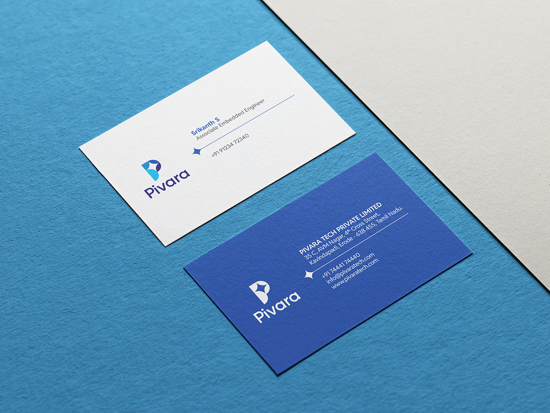
An acronym-based naming approach was selected to ensure clarity, uniqueness and eligibility for trademark registration. The name “PIVARA” was created from the phrase “Predictive Intelligence for Versatile Automation and Remote Access”. This definition reflected the core offering of the platform and provided a strong foundation for brand recognition.
The logo was developed using the first letter “P” combined with a star that represented clarity, insight and direction. Four circles were introduced to symbolize connectivity, synchronization, intelligence and productivity. The geometric refinement by colouring each segment formed the letter “P” as a monogram. Shades of blue were used to reinforce technological reliability and a modern visual appeal.


Pivara T-shirt
We are confident that this carefully crafted logo will be essential in establishing PIVARA’s brand identity in the minds of consumers.