Projects that define us
One of the projects that made a lasting impression for our client
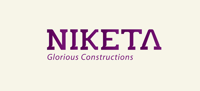


Revitalize Brand Niketa Constructions
work INFO:
Client: Niketa Construction
Date: 30 May 2011
Categories: Brand Revitalization
22 year old brand Niketa constructions wanted to revamp their brand identity. They were regarded as a highly trustworthy organisation. Now they wanted to capitalize on it and depict themselves as premium builders.
We started off by studying and benchmarking competition and top builders respectively. Preliminary research revealed that most construction companies had a sans serif typeface. Blue and red were the most commonly used colors in this category. Consumers felt that the communication from most companies in the category were feature led. They were selling houses and not homes. They also felt that most apartment buildings required major renovation after 10 years.
Niketa‘s proposition was the fact that it banked on quality. Being in the industry for over 22 years had helped them to build immense trust. This was their strongest point.
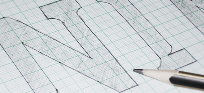
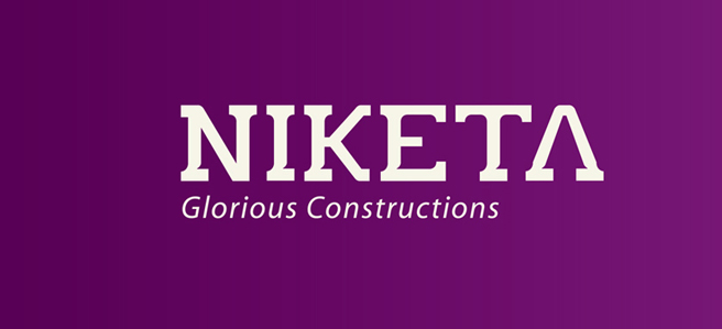
In order to bring out trustworthiness of the brand, the symbolism of Pillars were used. It conveyed strength, balance and grandeur. A new block serif typeface was created in order to give each character in the logotype a base like a pillar. The color purple was used to depict royalty. A complimentary icon was also developed in the form of the letter ‘N’. The identity for Brand Niketa was a result of a story that it had written for itself over the years and our job was to glorify it.